The colors and composition of this book cover are quite stunning. I love the juxtaposition of textures and the unexpectedly hued foliage. The title and other text is left very stark and simple, so as not to compete with the fascinating image.
I've been a professional artist for many years,and recently I've studied Computer Graphics and beginning Animation at Parkland college and Grand Rapids Community College. My primary areas of focus are Adobe Suite, and Flash. I am sharing my adventures and discoveries in this exciting new mode of expression, as well as new work in traditional media.
 John E. Kaufmann's image "Reflections of the Shire" was created entirely in Photoshop. In the past he had done illustrations exclusively in airbrush and acrylic paint, but found that he could create even better effects using Photoshop.
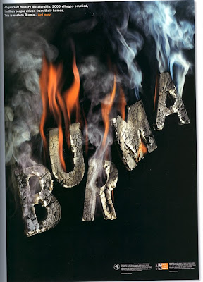
 This poster by Harry Pearce graphically portrays Burma's plight and its need for help. The placement of the burning letters gives the impression that they are also falling, like crumbling rafters.