Tuesday, June 9, 2015
Building a Castle Part 3
My next step in this image was finding some sky I liked better than the original photo had. These clouds seemed to have the light coming from about the same direction and time of day. As with the castle, I used adjustment layers to correct the color. Curves was especially useful, as it gives more control over the individual reds, blues, and greens.
Monday, June 8, 2015
Portfolio Project Label
I am going through all the exercises
and portfolio projects that my college classes did not have time to cover. This
is my own original image based on a project in chapter two of Adobe
Illustrator CS6. They provided only the text to be used, and suggestions
for research to create the best label for the "client". Except for
some minimal Photoshop work, everything was done in Illustrator, including
image tracing the P.S. images. Also used Type
on a Path and Gradients.
Monday, May 25, 2015
Ken's Fruit Market Project possible layout
I get too enthusiastic about Photoshop, and must move along to InDesign! Here are some possible layouts for the ad. I really liked the idea of putting a background image behind the items. However, I realize it might make the page too cluttered, detracting attention away from the products.
I am happy with how the versions of the logo and other images are working together into the headings. May find another place to put the image of Ken's fruit market, maybe as another heading to add variety, rather than just duplicating the original on each page.
Ken's InDesign Project adjusted photos & logo
Here are some photos I've adjusted for the ad. Removed labels from the apples, background removed from the bread, and combined elements from some of Ken's ads and the little girl's photo to create a new headline for one of the pages.
Ken's InDesign Project photos
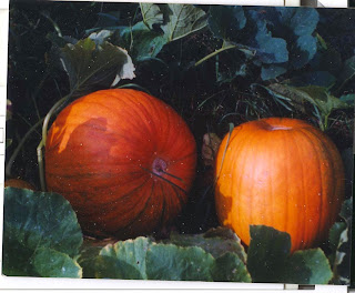
Some of the photos I took at Ken's for possible use in the InDesign ad, plus a photo my sister-in-law Theresa had taken of pumpkins. I will be doing a good bit of Photoshop work on them before placing them in InDesign. I've decided to make the ad for Autumn sale.
I will be doing some cropping to focus on specific products, and removing signs and some labels.
Ken's Fruit Market InDesign Project
To improve my skills, and to practice what I've learned in my InDesign class, I got permission from Ken's Fruit Market to make a mock advertisement for their store. The images above I obtained from their Facebook site, and will be using Photoshop and InDesign tools to adapt them.
This will be a four-page document- like a big ad in a newspaper. Ken was kind enough to give me permission to take photos of the store and merchandise. Some samples of those photos will be in the next post.
Friday, May 22, 2015
Building a Castle Part 2
Using the clone tool, I eliminated the obvious modern spotlights, then duplicated
the only existing roof, adjusting the size and shape for other portions of the
building on a separate layer. Keeping all such changes on different layers
prevents damaging the image, and allows room for adjusting size, placement,
etc.
On yet more layers, I repaired the top of the walls, and got rid of the worst of the cracks. Using other photos, I added rougher plants so the lawn wouldn’t be too perfect, and an edge for the moat. I masked out the sky, and adjusted grass colors.
On yet more layers, I repaired the top of the walls, and got rid of the worst of the cracks. Using other photos, I added rougher plants so the lawn wouldn’t be too perfect, and an edge for the moat. I masked out the sky, and adjusted grass colors.
Subscribe to:
Posts (Atom)


